

PULSEIR
/ Branding
/ Web design
/ Layout
/ Print
/ Creative direction
Client
PulseIR is a tech company based in Vancouver, BC, catering to the investor relations industry.
Brief
Create a sleek, simplistic, and modern brand suitable for the investor relations industry.
The Logo Process
Below are a few other logo concepts with different styles I was exploring. Very thick typefaces or breaking up the word onto two lines didn't work given the audience and brand tone. I decided to go with a more traditional approach as it would resonate more with the older generation that makes up most of the target audience. The arrow created represents similar arrows found on stock market charts and an increasing stock price.

To keep with the corporate, sleek, tone of the brand, social media posts feature pictures and reels with dark overlays and simple white layouts with light typography. Lime green is used subtly to add a pop of color to posts, but not too much to overpower the seriousness of the industry and information.


When designing layouts, I included thin lines for footers, tables, and to separate information to create documents that are easy to read, even at a glance. I used a pop of green for page numbers and CTAs while keeping pages white and using imagery with dark overlay for contrast. The arrow from the logo was also included as a graphic element on pages with less information to tie the brand together.
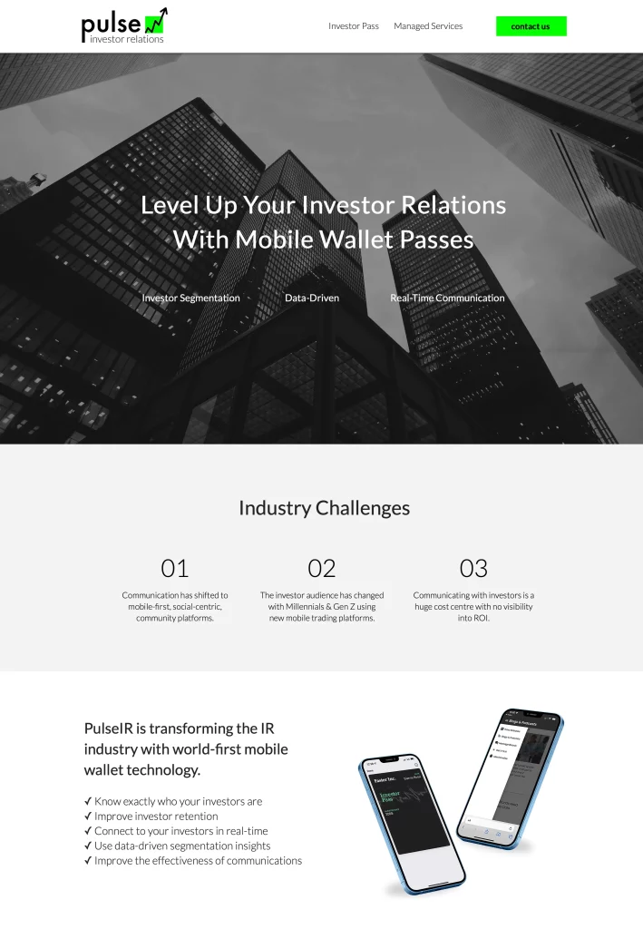

The Web Design Process
The website was designed to be functional, yet consistent with other assets in showcasing the brand through thin lines and fonts, dark imagery contrasting with light and simple layouts, and bright CTAs. Lots of imagery was used to help showcase the product efficiently, along with jargon-free copy that explains the tech in a way that is easy to understand. Simple navigation, with few pages and clear headings and CTAs were added to make the UX seamless.


